Mapping socioeconomic data: Israel
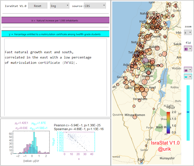
It can be difficult to find and research socioeconomic data in an accessible and graphical context, and in some countries, up-to-date data are available only in the local language. The (perpetually free) 'IsraStat' app below displays graphical bubble plots and cross-correlates socioeconomic data in Israel. A snapshot demonstrating the idea (click for a better resolution):
You can use the app directly from this page, as explained below. A snapshot like the one above can then be produced in under two minutes even on a mobile phone, as illustrated in this video:
The above three-minute video (best viewed at 720p) also demonstrates the app usage.
If you have Wolfram Mathematica or the free (but heavy: 1GB) Wolfram Player installed, then simply download IsraStat and run it locally on your machine; a snapshot can then be produced in under a minute.
Otherwise, use the following online app, which can take ~30 seconds to initialize (wait till the blue line on top stops running). Some online commands take ~10 seconds to respond, and Wolfram Cloud tends to get stuck on multiple/premature clicks, so some patience is needed (as in the above video):
Feel free to use the app for any purpose. If you write something based on the results, please verify them first, as I cannot take responsibility for errors especially in the source files (access data links by clicking the source button), and kindly provide a reference to the present post: https://nonexpertdives.blogspot.com/2023/04/SocioEconomicIsraelMap.html .
One may wish to normalize some field by another (say, the total budget by the population), but this feature is still unavailable in the present version (IsraStat V1.0; inactive buttons have a red font); additional functionality and data can be added if there is sufficient interest. If you spot bugs or mistranslations (by Google Translate, for the most part), or if you used the app to find an interesting effect you would like to see featured below, please leave a comment.
- Fast natural growth east and south, correlated with a low percentage of matriculation - additional stats (given in option 5 in 'fld'):
- Little government spending in the periphery:
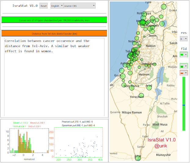
- A higher prevalence of cancer in the periphery:
- Correlation between cancer prevalence and the socioeconomic index:
- Correlation between wage inequality and voting percentage:
- Distribution of road accidents with casualties among cities, towns, and regional councils:


Comments
Post a Comment